Form elements
There are two basic types of elements:
-
Fields
Ask information from the user. -
Texts
Only display text. They can be used to orientate the user.
Fields
There are different types of fields. Short texts, long texts, multiple choices, dates, etc.
Fields share these common options:
-
Required
It won't be possible to send the answers until the element marked as Required is completed. -
Name
A short text. This is the new element's name. -
Description
A longer text to describe what you ask for.
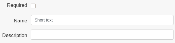
Short text
Displays a Short text field, a one line text.
-
Example
Give an example to whom answers the form, a placeholder. -
Default
Give a predetermined answer in case the user does not fill this element up. -
Type
Define if it requires a short text or an email.
Use this element to solicit information like a Name, Postcode, etc.
Long text
Displays a Long text field.
-
Example
Give an example to whom answers the form, a placeholder. -
Default
Give a predetermined answer in case the user does not fill this element up. -
Rows
Define how many rows is the user expected to fill. The more the rows, the greater will the box look. This does not limit the text extension.
Use this element to solicit extended information like an opinion.
Dropdown options
Displays a dropdown list of selectable options.
Options
Define selectable options.
Single choice
Displays a group of options. Only one option can be selected.
-
Inline
Display the options horizontally, on the same line. -
Options
Define selectable options.
Multiple choice
Displays a group of options. Multiple options can be selected.
Early morning session
Early afternoon session
Evening session
-
Inline
Display the options horizontally, on the same line. -
Options
Define selectable options.
Date
Displays a Date field.
Number
Displays a Number field.
-
Default
Give a predetermined answer in case the user does not fill this element up. -
Min
The minimum value accepted. -
Max
The maximum value accepted. -
Step
The interval that arrows change.
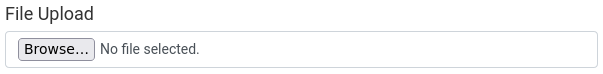
File Upload
Displays a File Upload field allowing users to upload a file from their device.
Texts
These elements only display text. They do not ask any information.
Title
Displays a line of big text to the user, better known as a title.
Name
The text to be displayed.Type
The size of the text.h1biggest,h6smallest.
Paragraph
Displays a paragraph of text to the user.
Content
The text to be displayed.